Swirl Identity & Packaging
Swirl was a startup “all natural” lotion company, marketing themselves as an affordable brand catering to all ages. Making the move from a home based business, they approached me to develop their logo, business cards, and packaging for their three lotion lines. They requested a clean, versatile logo and packaging that would stand out against their competitors, while staying within budget.
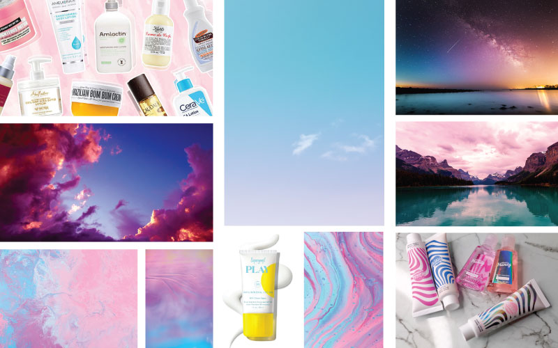
Swirl Moodboard
Identity, we all need one.
Early in our identity conversations, Swirl had two requests: corporate colors that reflect how their products work both day and night, and to see how the font Parkside could be modified to be less “scripty” for their logotype.
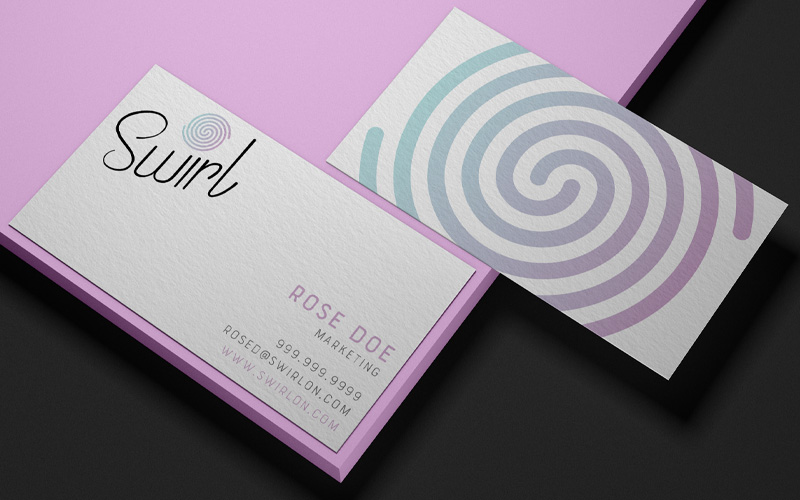
After some research, I realized a combination mark would be the best route to fulfill Swirls needs. A “swirl” logomark incorporated with their logotype would give them the versatility they wanted. Not only could it stand alone once the brand was established, but its color could change according to usage.
Combination Mark Development
Combination Mark Final
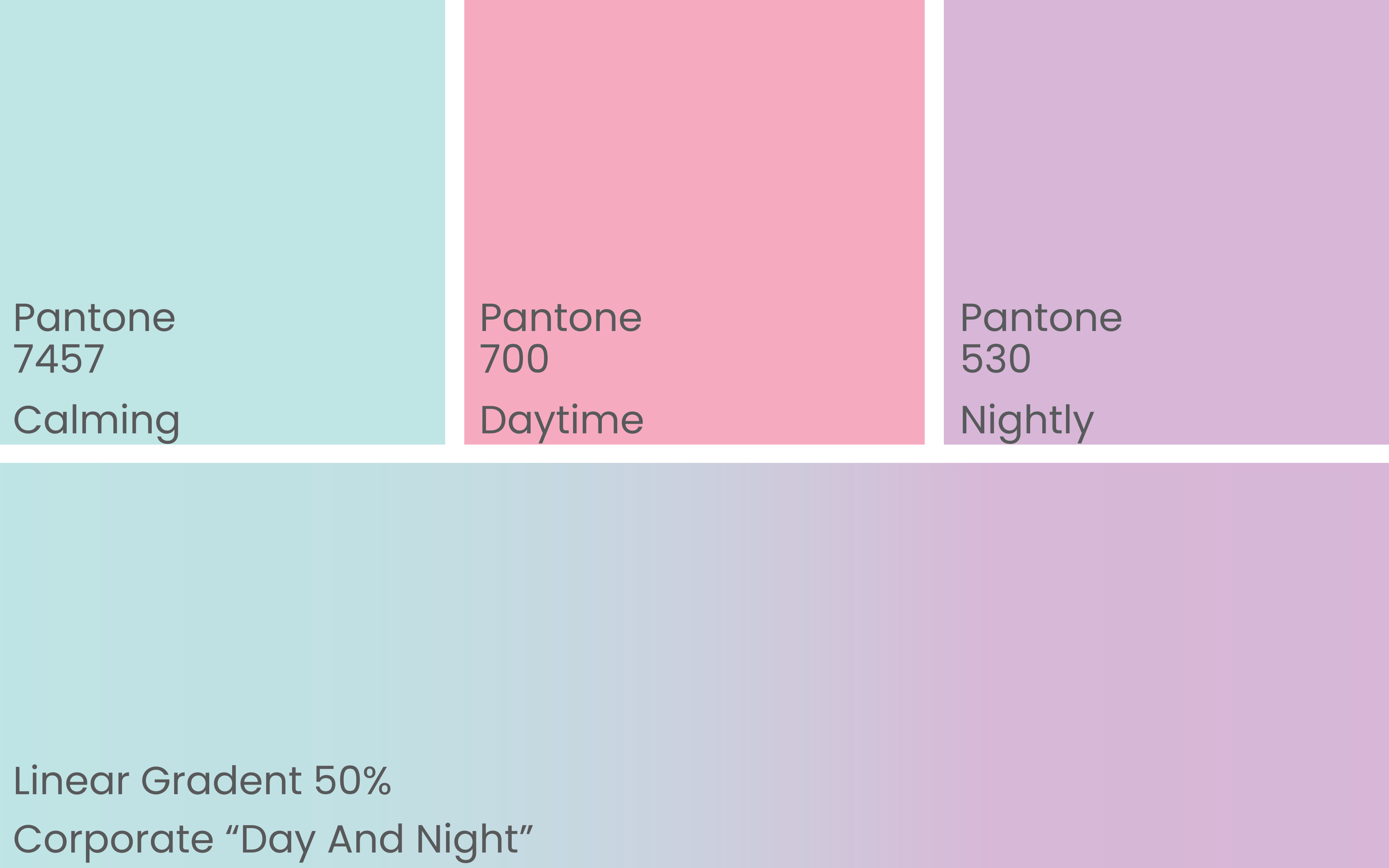
Swirl Colors
Putting it all together.
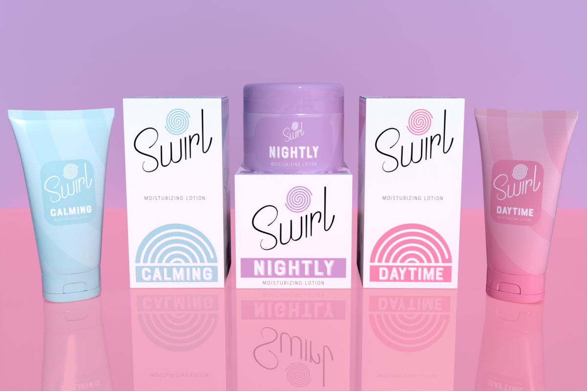
Presenting the colors and combination mark to Swirl was a success! The colors lined up with their product lines, and the logotype fit the company. Using a gradient to represent the day/night cycle for their corporate office really helped Swirl understand that their logomark could carry a lot of weight.
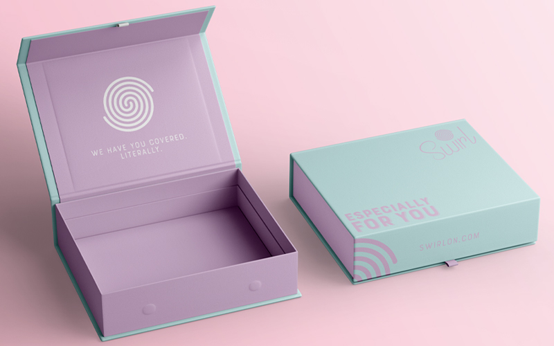
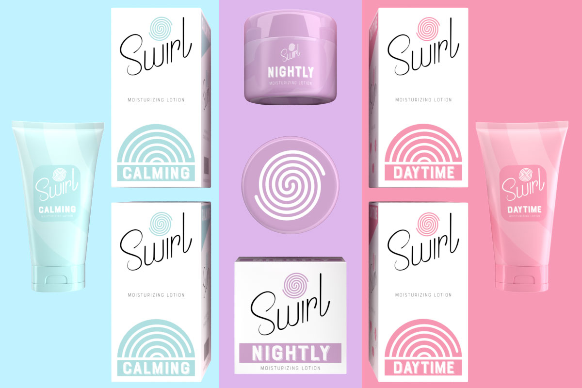
Package it up nicely.
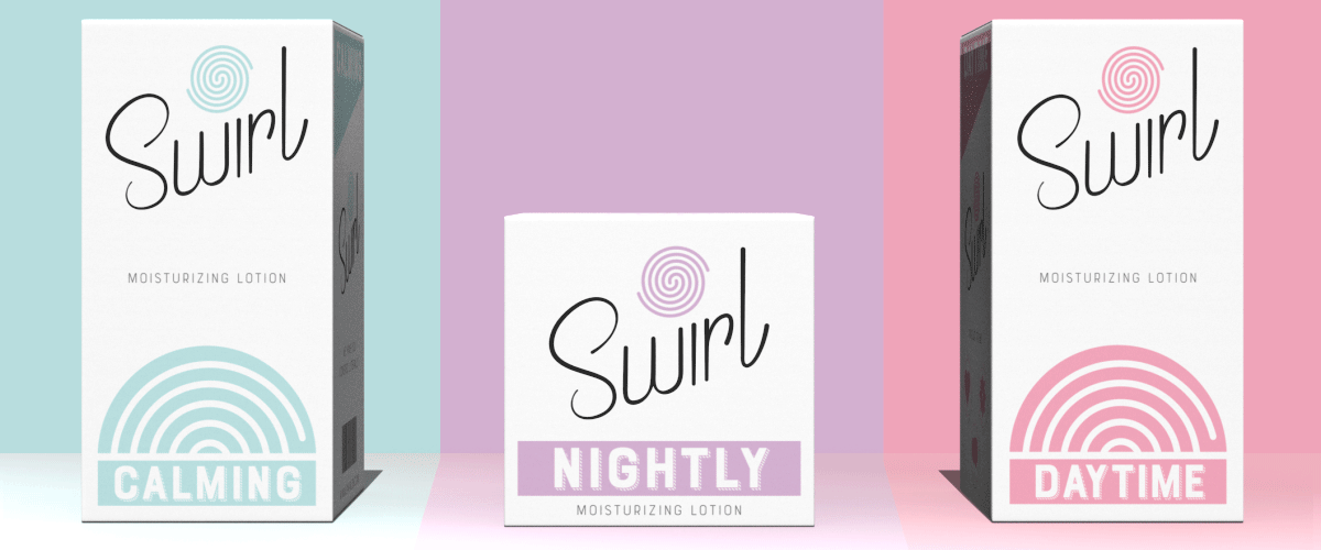
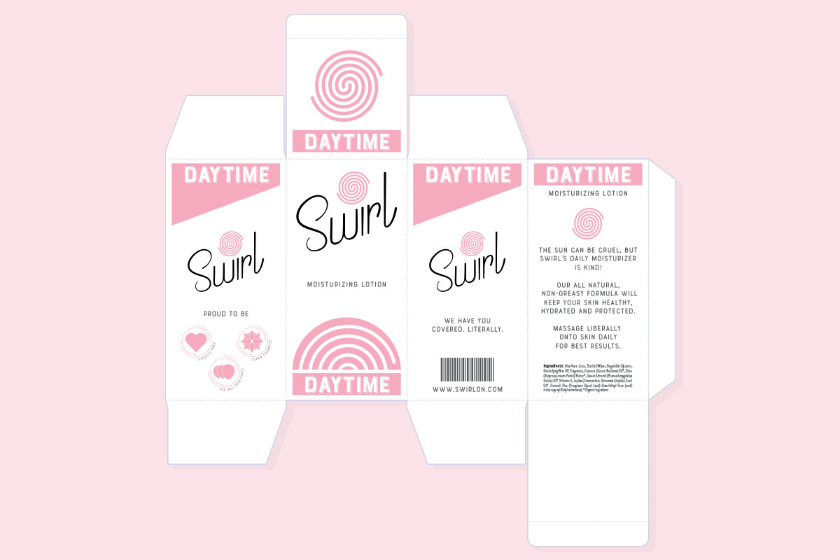
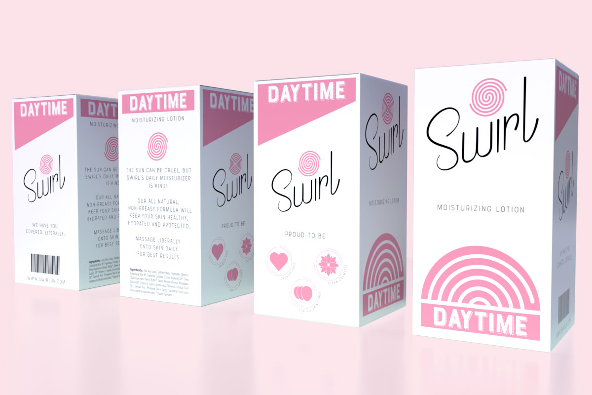
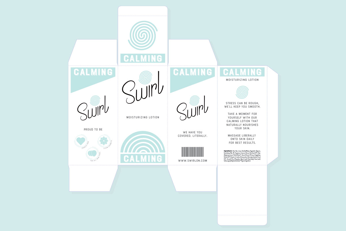
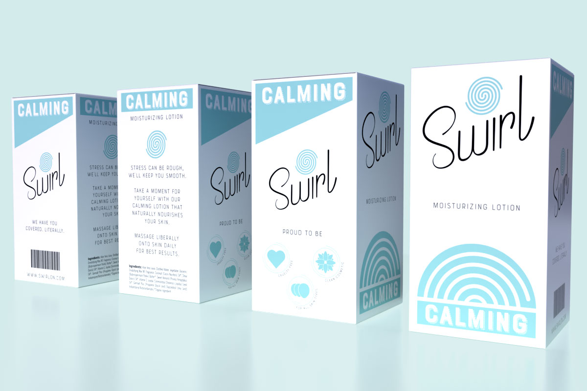
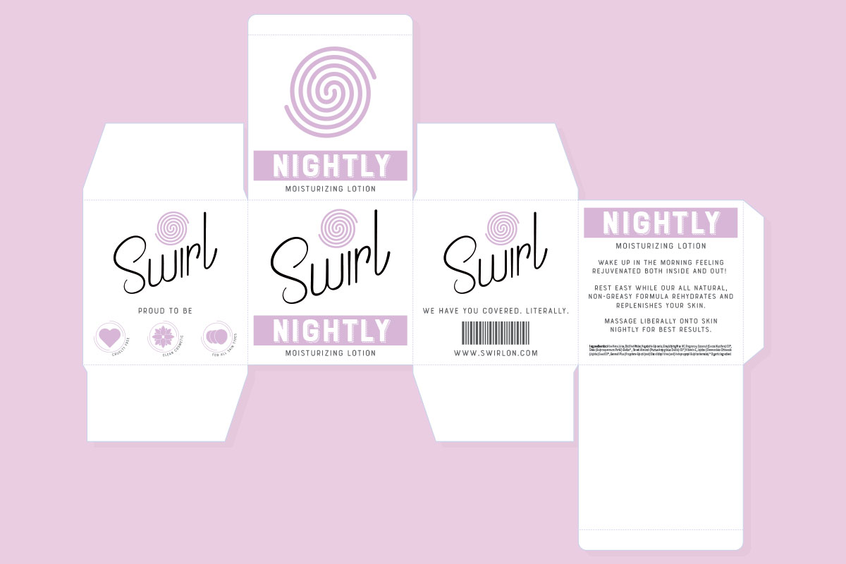
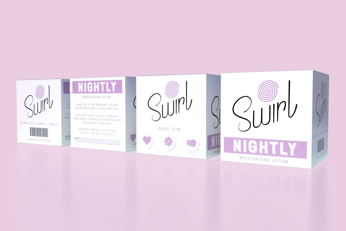
Designing Swirl’s packaging posed the challenge of balancing visual appeal and budget. While a suggestion was made to go without a box, the need for future regulatory information made it almost mandatory.
Keeping in mind Swirl’s position, I decided to create the packaging using a two color concept. The product line’s pantone color would insure printing consistency, while the contrasting logotype in black would make the product easily recognizable. With Swirl’s consent, I went to work creating icons, item descriptions, and mock ups.
Wrapping it up.
Swirl was extremely happy with all the design work. The ability to take a concept and produce 3D versions of their products made all the difference. Seeing is believing.
While I enjoyed working with Swirl, I was a bit saddened to hear shortly after completion that their funding was gone. Alas, it only lives digitally.