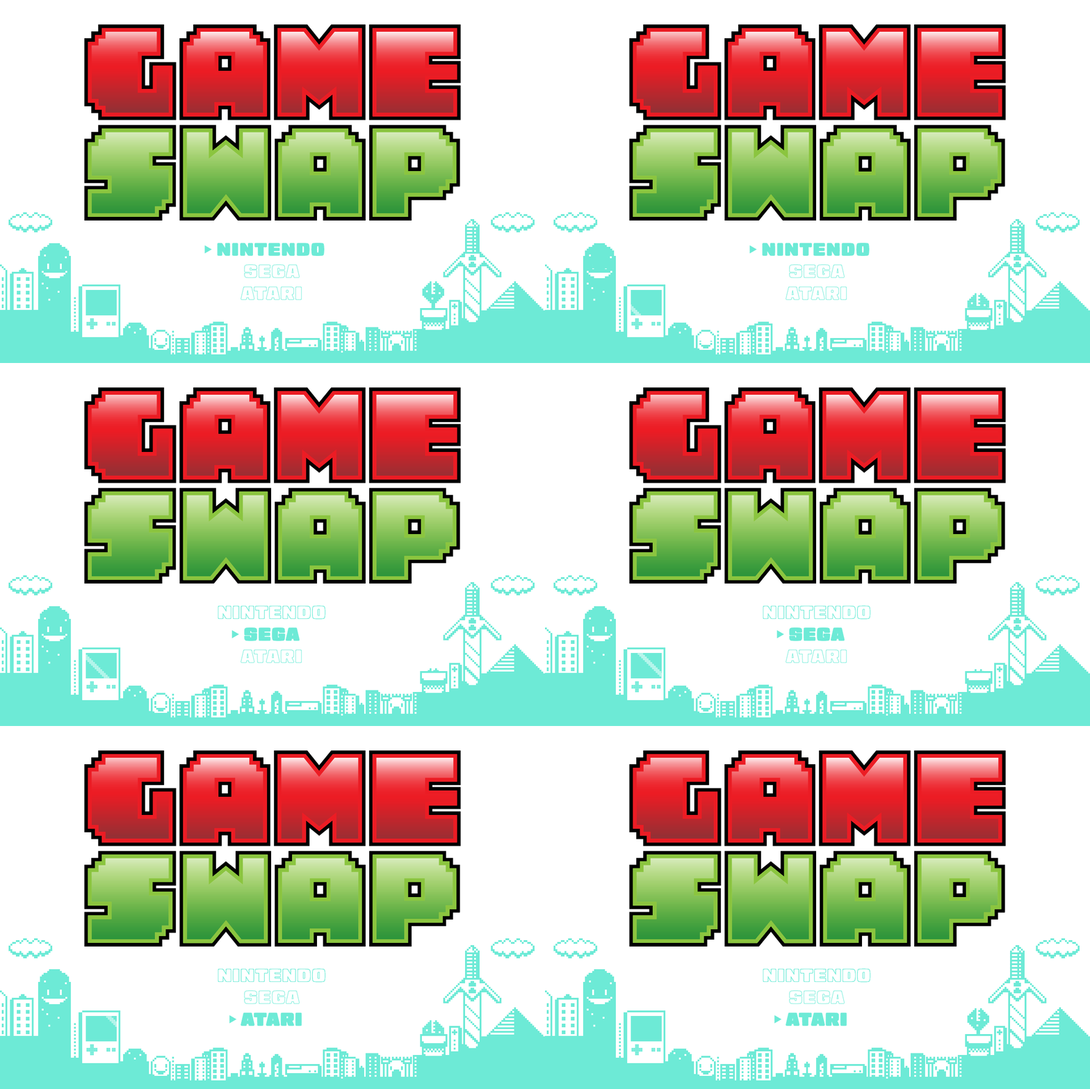
Game Swap Identity Design
Game Swap is a vintage game and collectables shop in Kettering, Ohio. For over 10 years they’ve been well known for their selection of hard to find vintage games, but when customers were asked to describe their logo, most were at a loss.
While they did have a logo, it was hardly used in any of their marketing. With their only online presence being Facebook, they used multiple iterations of the company name, but nothing unifying. There was no cohesive feel to the store.

Game Swap Moodboard
Restart.
It can be easy for a small company to lose track of it’s visual identity. With a lot of moving parts, re-orders, and day to day duties, when do you have time to think about your overall appearance? In the beginning it’s easy to get a logo, and think you’re done. But without cohesiveness, a logo is just art.
In my meeting with the manager of Game Swap, we came up with a game plan. Going off of the preexisting red and green color scheme, he wanted a logo that was fun, bold and represented their niche. Other items would be designed for their business cards, gift cards, and bags that would simple, but unifying in their relation to Game Swap.
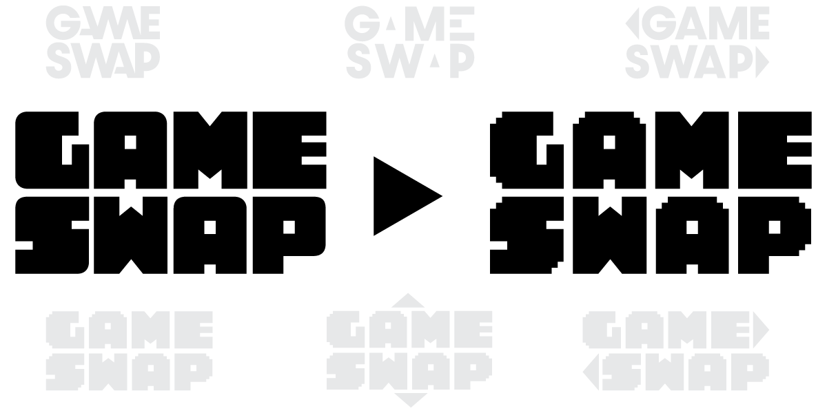
Game Swap Logo Development

Game Swap Logos Final
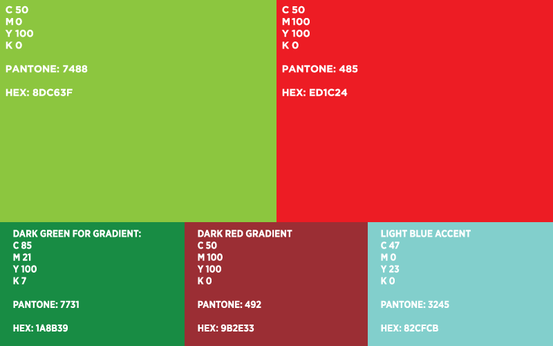
Game Swap Colors
Ready Player Two.
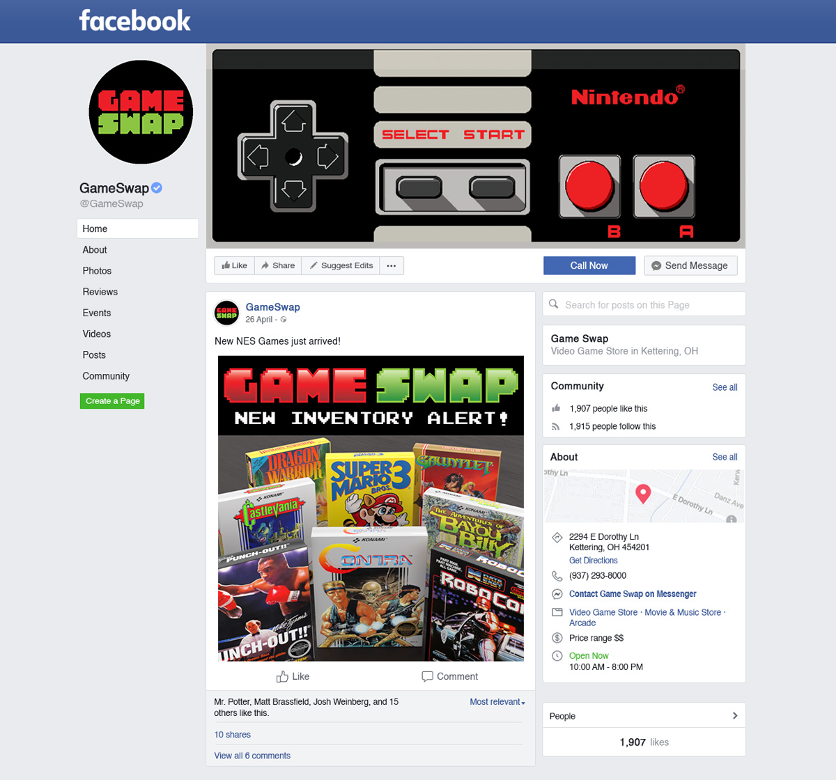
I presented the logo to Game Swap, along with a mockup of their Facebook page. The reaction was great, but there was one question: where did the controller art come from?
Enter player two for their identity, pixel art. What better way to cater to their niche, and give them the feel they wanted? I had created the controller pixel by pixel, and was already at work on other items. They loved it, and were excited to see the rest!
Pixel by Pixel.
Pixel art can be both relaxing and time consuming. I figured that out while working on the business card and background design for the bags and gift cards.
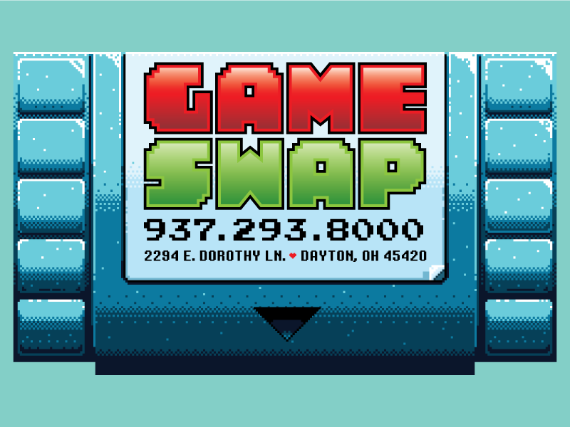
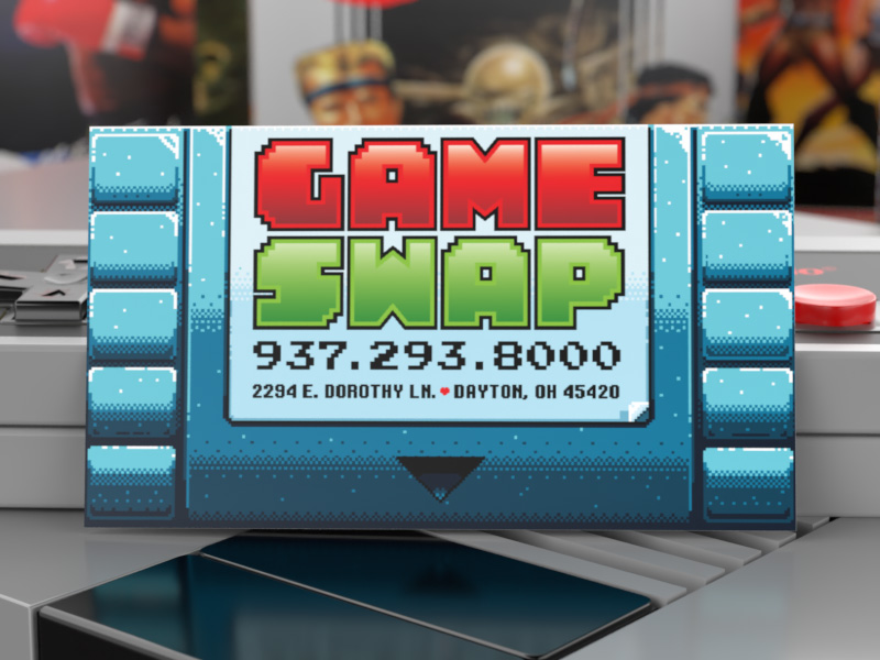
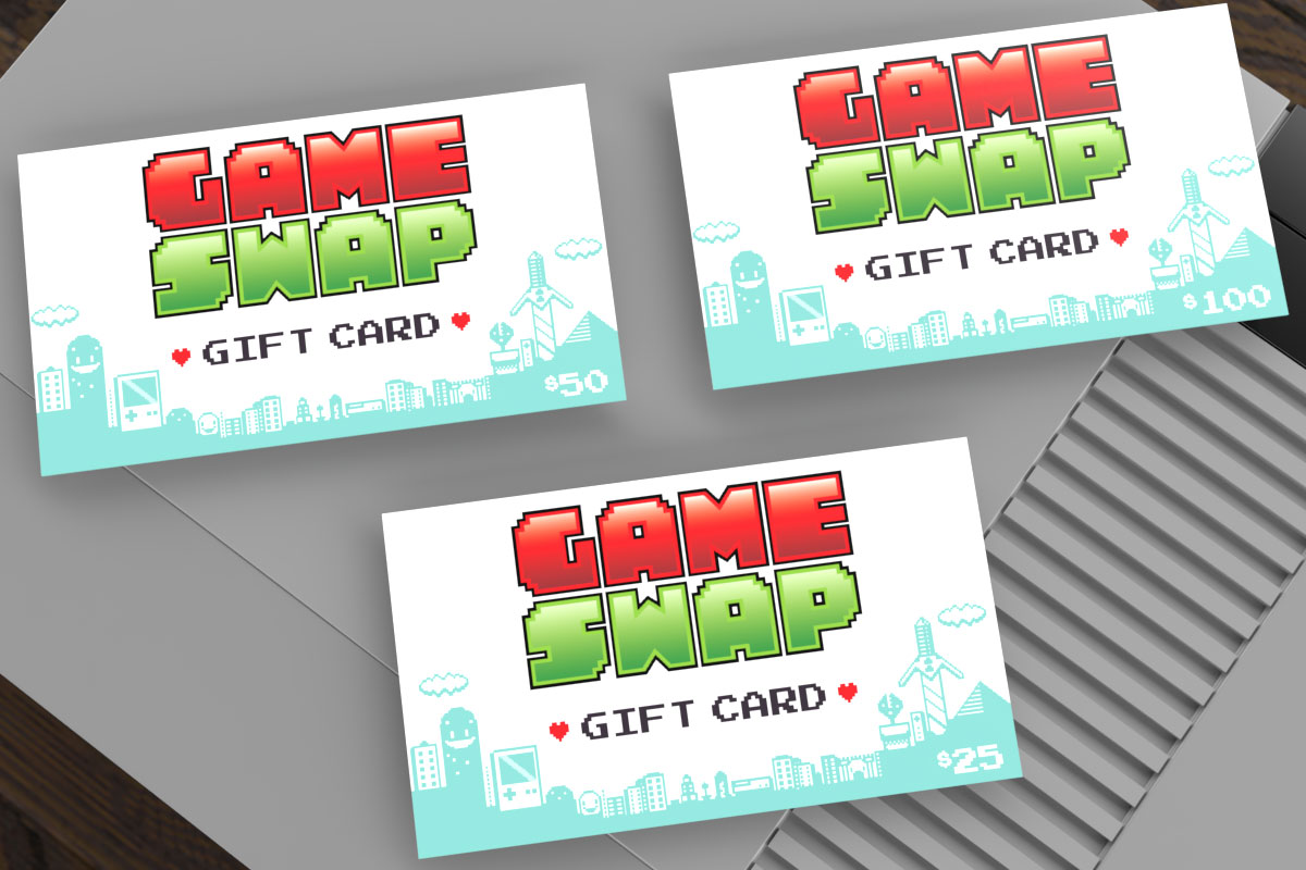
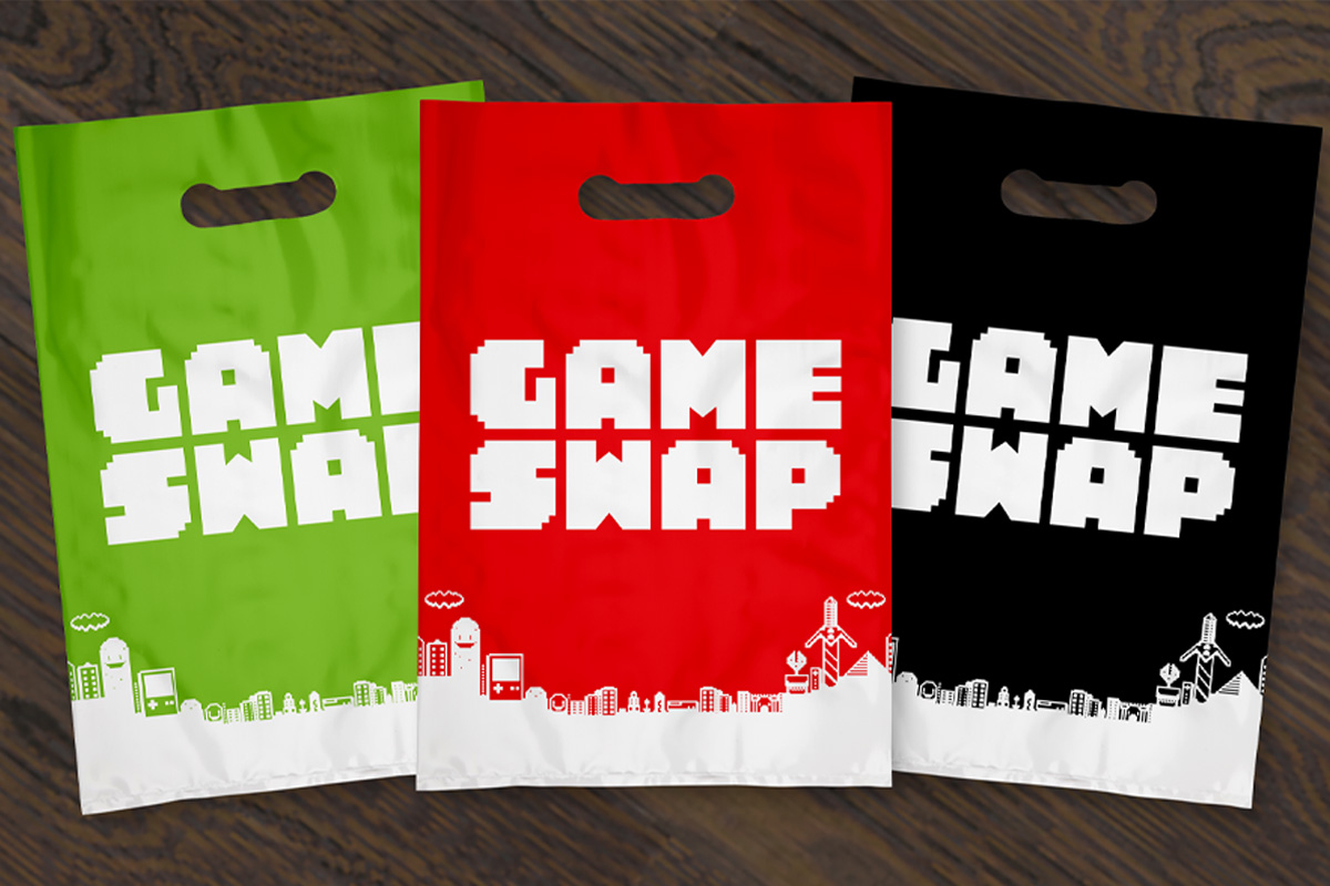
For the business cards, I decided to go with an old game cartridge look, complete with dog-eared label. I designed the background of the gift cards and bags to look like an old Nintendo start screen, complete with easter eggs that gamers would enjoy spotting.

A Winner is You!
With all designs finished, I delivered them to Game Swap. I was amazed at how good the feedback was from their end. They loved the background, and the budgeting idea of making it a one color job for the bags. The gift card design was spot on, and brought cohesiveness to the company. As for the business card, it blew them away.
After leaving, all that went through my head was the end title for the original Nintendo game Pro Wrestling: A Winner is You! While excited and feeling accomplished about how things went, I had a feeling I would be working with Game Swap again.
