Hillcrest
Cochlear Implants Brochure
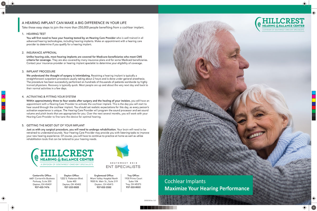
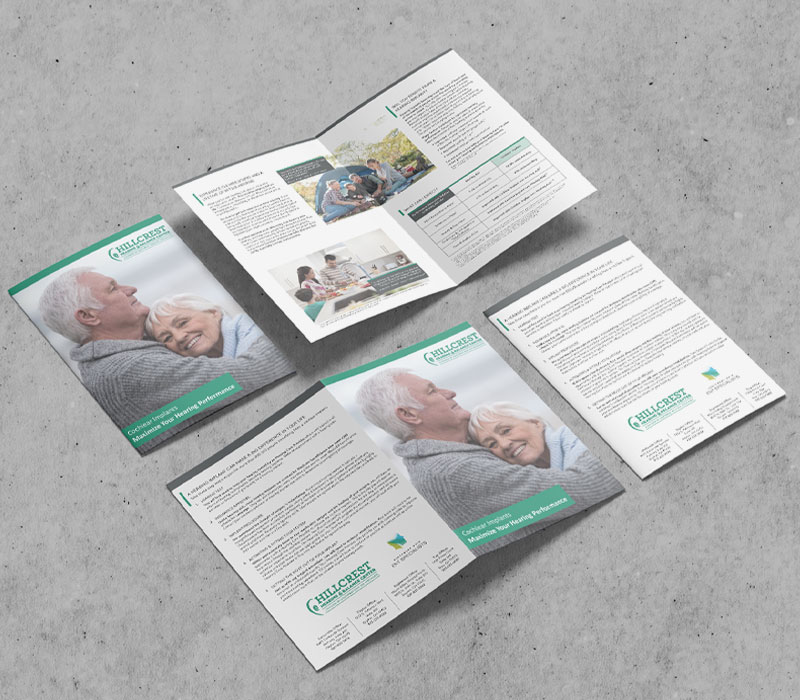
Hillcrest Hearing and Balance Center has been one of the most trusted hearing healthcare provider in the Miami Valley for over fifty years. When they decided to update and redesign their Cochlear Implants brochure, I jumped into action.
Hillcrest provided the updated information, color scheme and logos. Now it was time to lay it all out.
Puzzle Pieces.
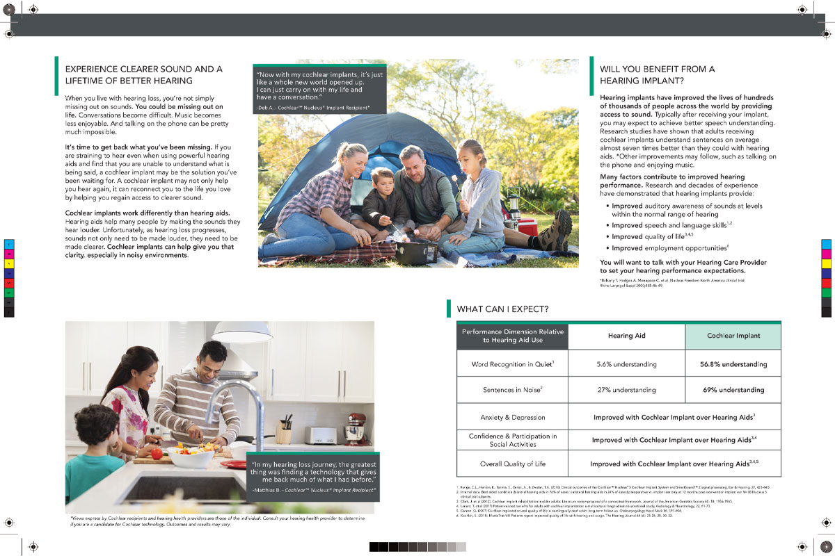
To start things off, I needed to figure out where each piece would fit. Reviewing the copy, I would have to make sure the size was readable for all ages and key points highlighted. I began thumbnailing different layout ideas to see what worked best.
The included samples were hand scribbled in a notepad while brainstorming. They have been cleaned up for better legibility. You’re welcome!


Who and why?
While a majority of hearing loss patients are older, it can affect people of any age. I decided to include all age groups in my photo search to visually reinforce that fact. Hillcrest was very receptive to the idea, and after images were approved, it was time to finish the brochure.


Delivering the message.
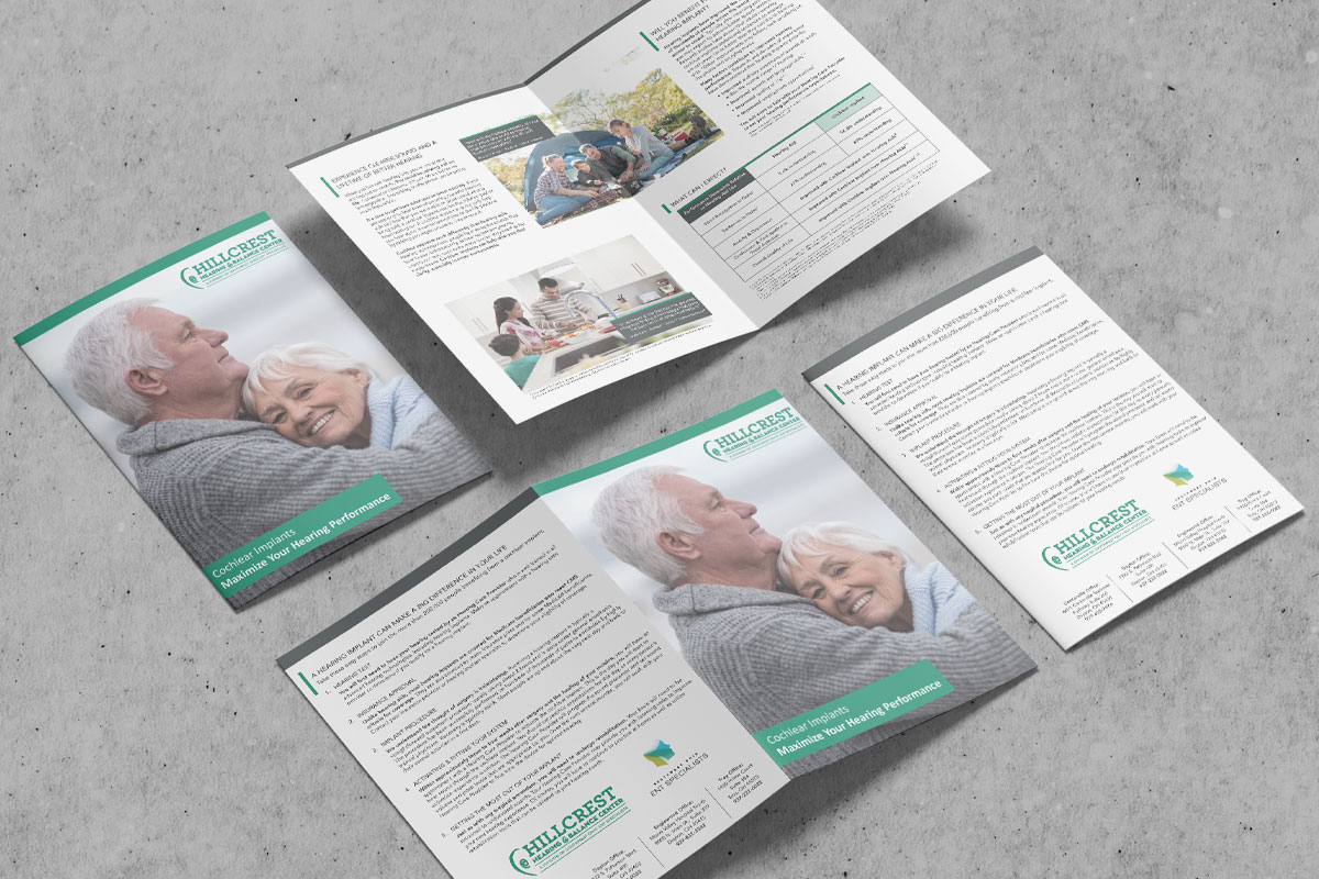
When the final proof was submitted to Hillcrest, I heard back immediately. The design not only gave them a way to expand their target audience, but did so in a way that was less sterile than most medical brochures.
Achieving a balance in content and visuals can be challenging, especially when designing for the medical industry. I was happy to be able to deliver a product Hillcrest was proud to present to their patients.
