AC Firearms Logo Design
When AC Firearms decided it was time to open shop, I was asked by a colleague if I would create their logo. As someone who enjoys fishing and shooting I couldn’t say no!
Not having contact with the actual company was the tricky part. Working through a representative on a rush job is never ideal, but the little information given was enough to make it happen. Because of that scenario, this piece won’t be too in-depth.
Quick draw.
The brief for the logo was just that: brief. The people at AC Firearms wanted a bold lettered logo with something besides a period separating the “A” and the “C”. What that item could be was the mystery.
After finding a font that worked with the company, I dug a little deeper looking for any ideas. At one point in the project a lightening bolt was suggested. While I did oblige, I didn’t feel that it would represent what little I did know about the company. I decided to go with my gut when giving options.
Sighting In.
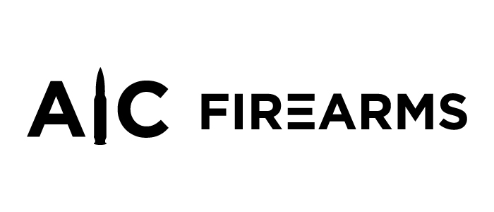
AC Firearms was impressed with what was presented with the limited information provided. While they liked the logo with the bullet, I felt it needed a little something more. The logo was definitely strong enough to work, but it needed a break in the black. I submitted one more proof.
Bullseye.
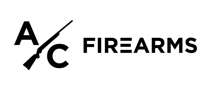
This version was on the mark. They loved how the negative space broke up the previous design, and gave them an option for a two color logo. They had what they needed to get things going!
When AC Firearms opened in Kettering, Ohio, I finally got to meet everyone. It was great talking with such welcoming people, and I look forward to working with them again!

