Habitat Home Inspections Logo Design
Based out of northern Virginia, Habitat Home Inspections contacted me about creating their logo. The owner already had a vision in mind of how he wanted it to look, he just needed someone to refine it. Marketing themselves to mountain homes and cabins, he requested an A-frame cabin and trees along with the company name. With an outline in mind, I set to work.
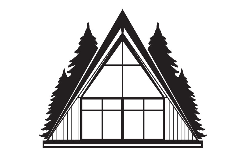
A-frame of mind.
Creating the A-frame design was trickier than I thought it would be. Early renditions looked a bit too plain, while others had too much detail. After a few more iterations, I found a happy medium.
The trees brought in their own challenges. I experimented with less detailed branches, but it made the overall image look sterile. There were too many straight lines in the design. I went with more natural lines to the trees, and it brought the contrast needed to make the design come together.

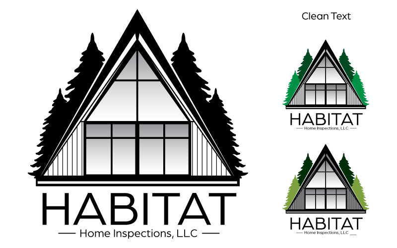
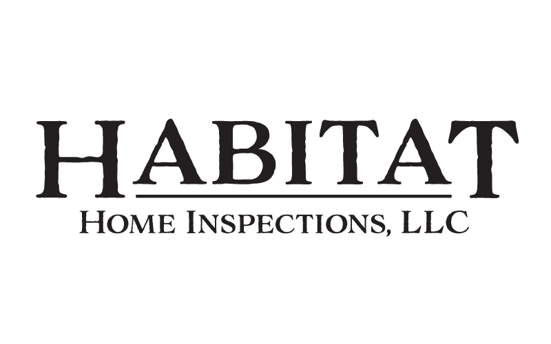
Habitat Primary Logo Final
Inspection.
The designs submitted to Habitat went exceptionally well. The A-frame and trees were exactly like he envisioned it, and he loved the clean, symmetrical design over the logo type. While he did like both type styles, the more rustic font fit the company better.
While I was happy to deliver the logo, I knew my work wasn’t done. While we both were happy about the design, I could see issues in the future concerning smaller print areas. A secondary logo was going to be needed to make sure his visual identity wasn’t altered due to size constraints.
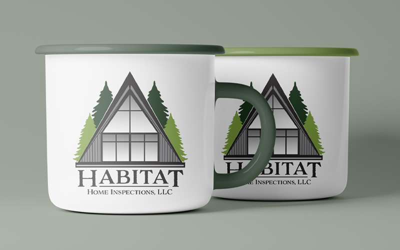
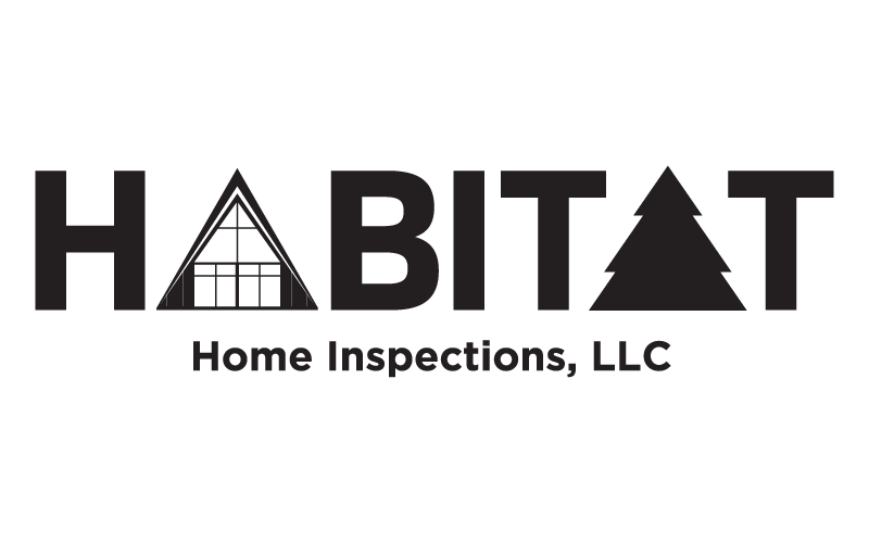
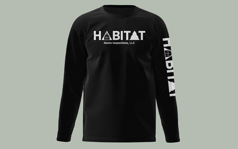
Secondary Logo
A secondary logo is always good to have when your primary logo has a lot of content. The house, trees and text for Habitat would be hard to read if printed in a small or narrow area. Look at it as insurance to make sure your visual identity stays intact no matter where it sits.
Knowing he loved the font, I decided to make a version with just that. While I liked it and it was readable in smaller sizes, I felt it was missing the essence of the original. After pondering my options, a light bulb went off in my head. My second idea would be a totally different font, but still have the feel he was looking for. I had to take the chance.
Did I pass?
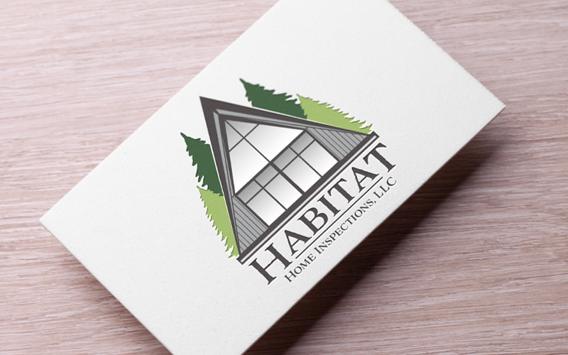
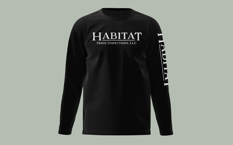
I nervously sent in the secondary logo designs and waited. Not too long after, I received a call from Habitat. I took a gamble with the design, and I beat the odds! They loved both versions of the secondary logo so much, they wanted to use both. Apparently the shirt sleeve design sealed the deal!
I really enjoyed designing for Habitat, and look forward to working with them again in near future. While the logo work is done, there’s still many more assets they’ll need to keep their company going strong.